

Borderplex Safe Mobility Plan
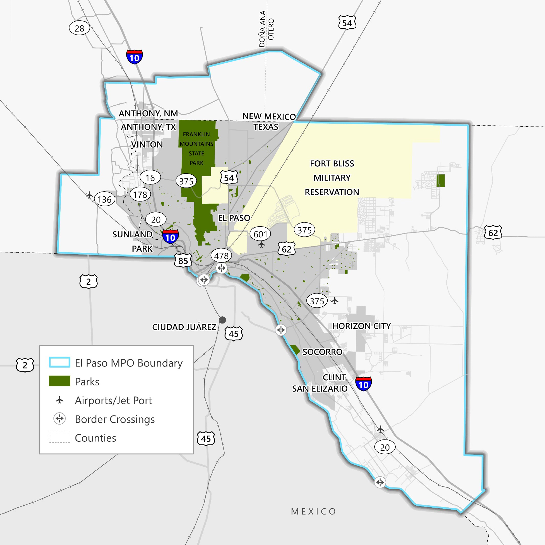
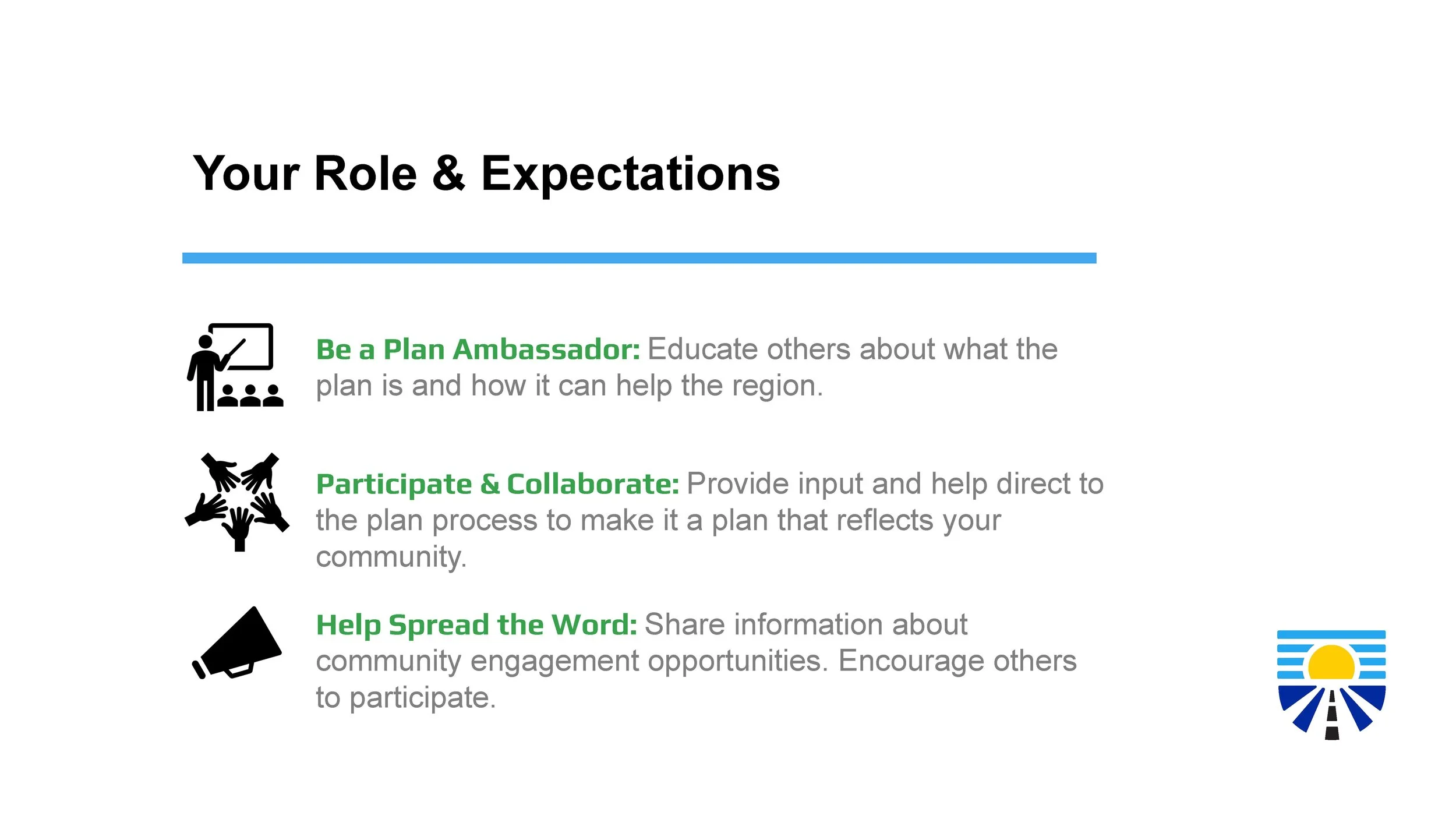
The El Paso Metropolitan Planning Organization (MPO) developed the Borderplex Safe Mobility Plan as a strategic initiative to reduce traffic-related fatalities and injuries across a broad region that includes El Paso County (TX), Otero County (NM), and Doña Ana County (NM). The project called for not just infrastructure and policy changes, but also a robust public-facing identity to unite stakeholders, educate the public, and encourage long-term participation.
Challenge
The MPO was looking for a brand identity that could:
Communicate safety, trust, and urgency to a wide audience;
Stand out from other safety initiatives in the region.
Balance credibility and approachability, while being flexible enough for both stakeholder presentations and public meeting materials.
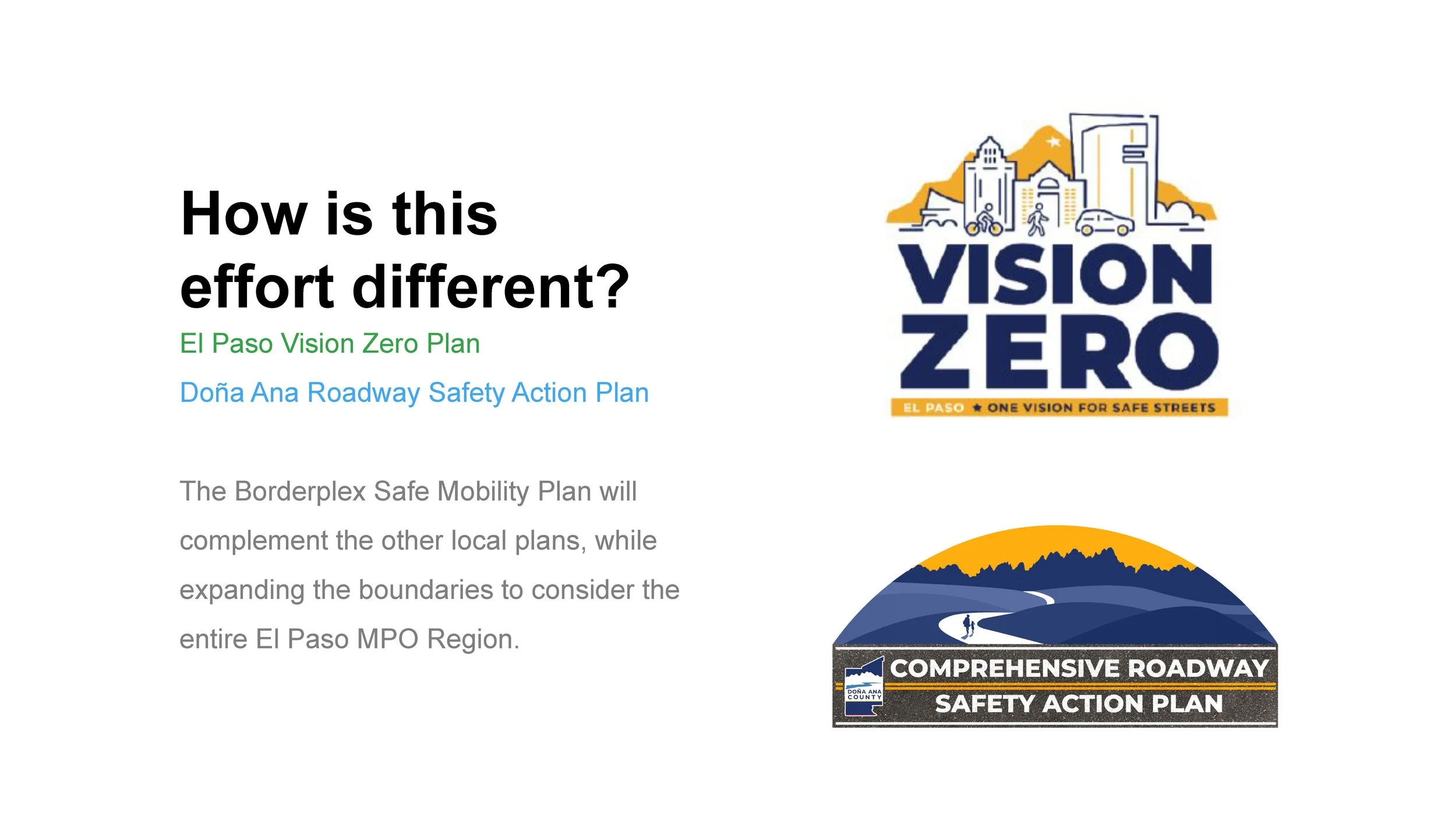
The Safety Action Plan would be viewed alongside other regional campaigns, such as Vision Zero El Paso and Doña Ana County’s Comprehensive Roadway Safety Plan, each of which used densely illustrated logos with city landmarks and silhouettes of people walking or biking.
While these visuals serve a purpose in their respective efforts, the MPO wanted to signal a shift in tone and scope. Rather than emphasize place-based identity or mode-specific transportation, this brand would focus on clarity, inclusivity, and long-term public trust across the region.
City of El Paso’s Vision Zero Plan

Doña Ana County’s Safety Action Plan
Approach
We began by aligning on a name: Borderplex Safe Mobility Plan. This grounded the brand in a regional identity, emphasizing safety and mobility over any single jurisdiction or transportation mode.
We then translated this into five core creative criteria:
Bold, not loud – commanding attention without alarm.
Minimal, not sterile – clean but not cold.
Friendly, not naïve – human without being cartoonish.
Symbolic, not literal – no silhouettes or city landmarks.
Regional, not city-centric – inclusive of the tri-county area.
The final logo centers on a shield-shaped mark, a timeless and cross-cultural symbol of protection. Its geometry is clean and distinctive, designed to feel professional in stakeholder settings and trustworthy in public ones.
We also ensured the mark was built to scale across formats:
Stakeholder presentations that required formality and gravitas.
Public meeting boards, where clarity and inclusivity were paramount.
Web and social media, where the logo had to perform at both large and small sizes.
Borderplex Safe Mobility Plan Logo
Vertical Logo

Horizontal Logo
Results
The final brand identity for the Borderplex Safe Mobility Plan distinguished the initiative from other safety campaigns in the region, not by being louder, but by being clearer.
Whereas other safety logos attempted to convey everything at once, our design created space for the initiative to speak through its content and outreach. The logo gave the MPO a tool that could adapt to its audiences, whether it was state transportation officials, city planners, or local residents at a public meeting.
The branding has since appeared across:
Stakeholder decks used in formal MPO presentations.
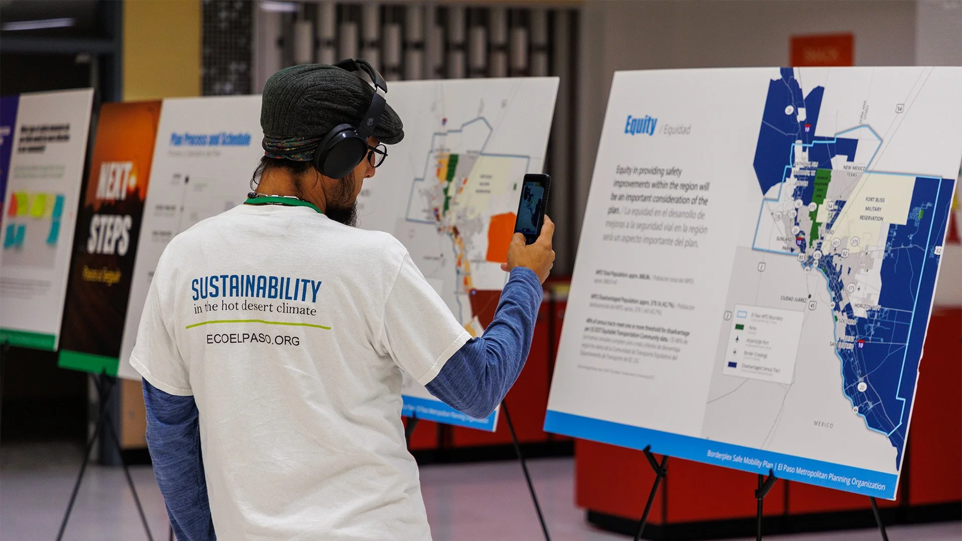
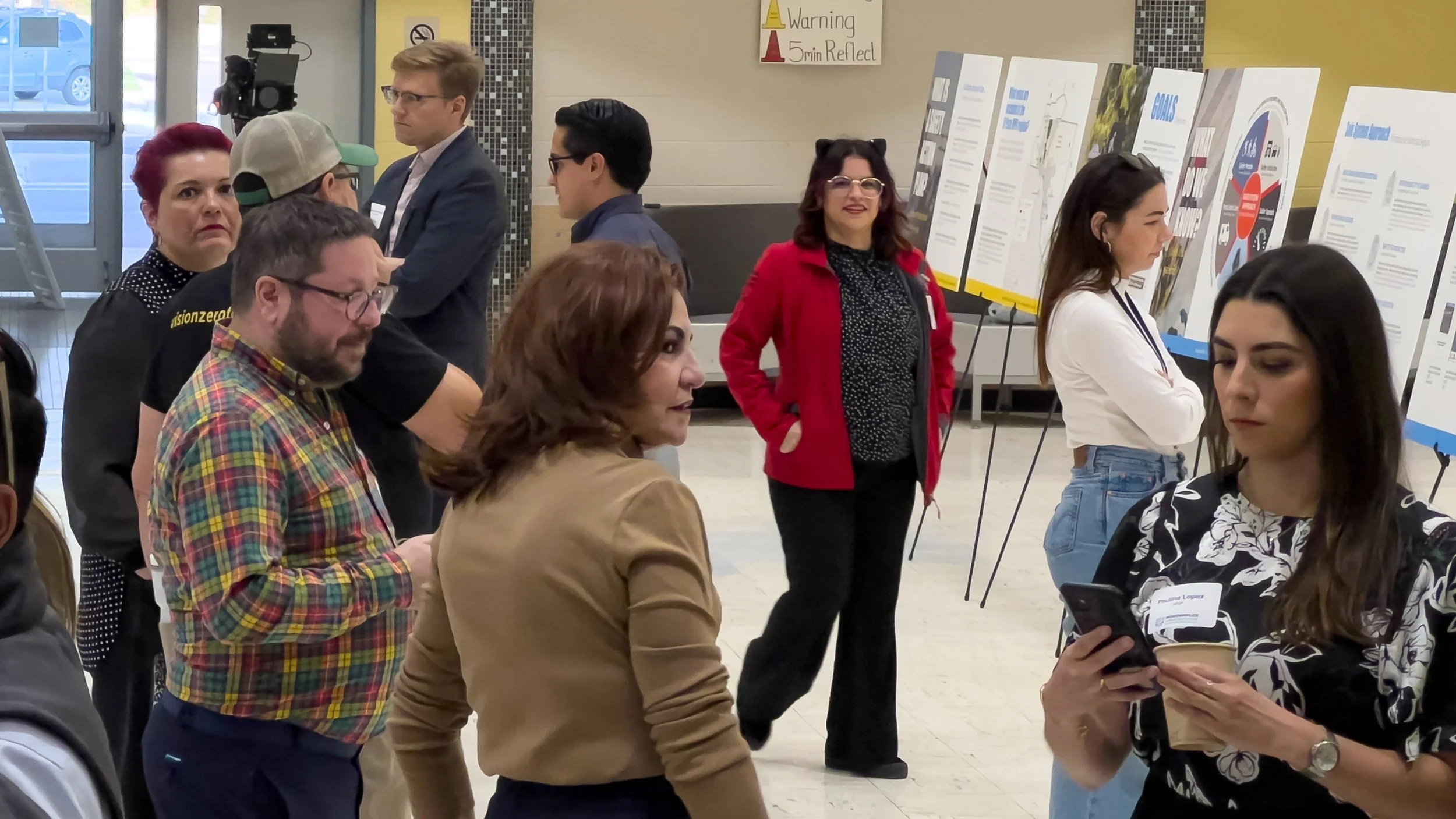
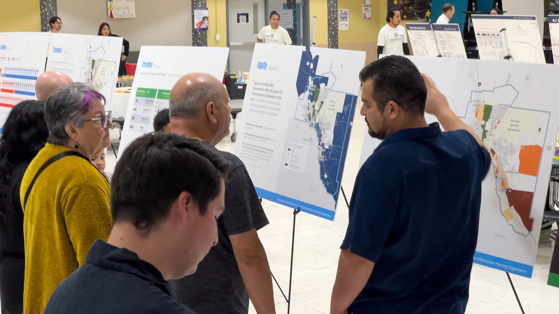
Large-format print materials at the first round of public engagement events.
Digital platforms, including the campaign’s informational website borderplexsafe.com.
By steering clear of city-specific symbolism and overly literal visuals, the logo positions the Borderplex Safe Mobility Plan as a serious, inclusive, and regionally unifying effort.


Project Team
Gabriel Garcia - Creative Director
Joseph Bueno - Graphic Designer